Pick Up That Can: The Problem With Interactive Objects
Walking the line between player immersion and good UX can be difficult. In this post, I discuss some of the constrains that push different kinds of games down different types of pathways.
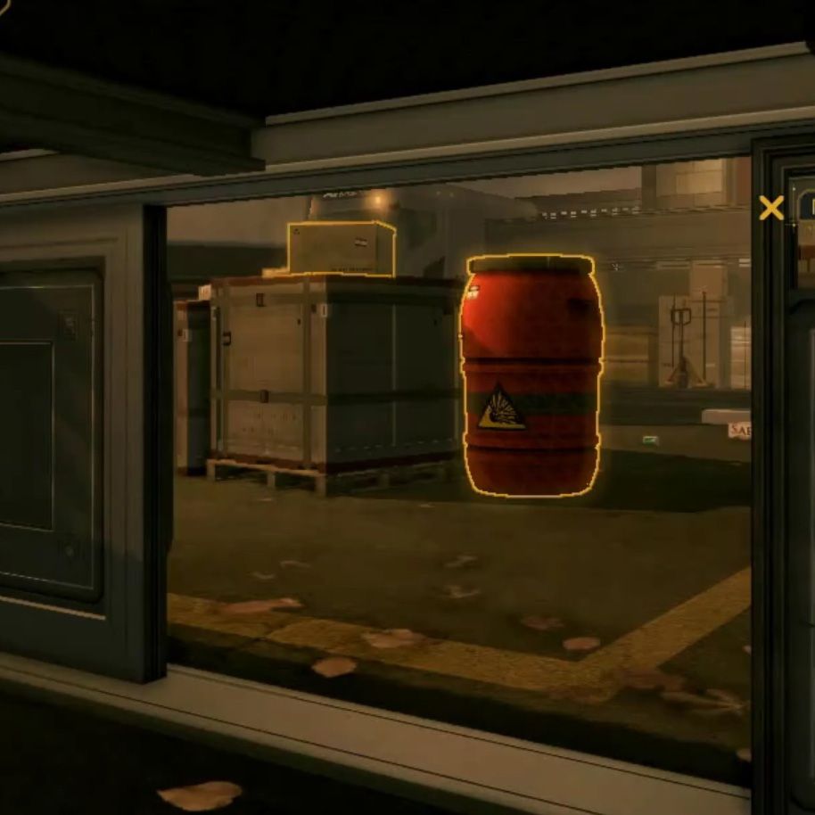
I’m sure that most of you have already seen the recently released Deus Ex 3 gameplay trailer. One of the game elements highlighted in the footage is Eidos’ method of calling out interactive items in the game world: a bold, bright yellow outline and highlight over anything you can interact with that’s more or less in the direction the player is looking.
Some of the fan reactions to the trailer have been quite surprising, with a few gamers going so far as to call themselves “outraged.” They don’t like having information in their face, and what’s more they seem to find the assertion that they need to be vaguely condescending. Some folks have even brought out the dreaded “immersion breaking” phrase. All this fuss over some simple object highlighting! Clearly, most modern games need some way of pointing out what is and isn’t relevant to help streamline gameplay, so what’s the big deal with Deus Ex’s method?
Framing the issue
First, let’s note that there are actually two different problems to address when it comes to interactive objects in modern games:
- Showing the player objects that can be used, picked up or manipulated.
- Indicating to the player which objects are actually important at this moment.
The concepts are similar but, importantly, the second problem is really a subset of the first. Further, the degree to which these two things differ (that is, how much of the former problem the latter encompasses) can vary a great deal between games. We can indicate the general range of this with the Internet’s favorite tool: a two-axis graph.
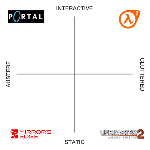
I’ve taken the liberty of inserting what I feel are four representative examples, one for each quadrant. I should emphasize that this graph does not assume any sort of value judgments. No quadrant is any better or worse than the others, it’s just a simplified way of quantifying our options.
Fleshing out the axes
Valve Software’s Portal gets categorized as both austere and interactive. Excepting the latter third of the game, there isn’t a lot of stuff sitting around in the Aperture Science testing grounds. This is not a game that focuses on props, but what is included is almost all interactive: auto-turrets that will attack you and can be knocked over; cubes to pick up and move around; giant red buttons to press; bouncing energy spheres to re-direct. We have Spartan environments combined with highly interactive game objects.
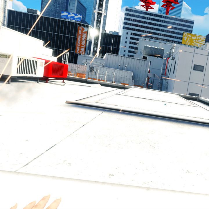
Mirror’s Edge sits at the intersection of austere and static. Though not nearly as focused as Portal, the level design of Mirror’s Edge is still beautifully direct. There are some props around to give the world flavor – piles of boxes on pallets, wooden planks to indicate good jump points; the occasional planter box or advertisement – but very few of these objects are meant to be interacted with. You’ll sometimes find a wheel that needs to be rotated or an enemy weapon that can be picked up, but that’s pretty much the extent of what you need to manipulate in the game.
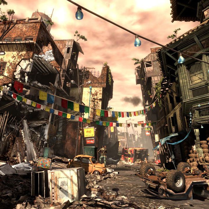
Sticking with static but moving along the horizontal axis toward cluttered we have Uncharted 2. This game has some of the most striking environments in this generation (not to mention being one of my personal favorites!) and they’re filled to the brim with stuff. In particular, the Nepal level is practically overflowing with props: burned out cars; piles of rubble and trash; orphaned furniture and appliances; plastic crates and other detritus of a city in conflict. For the most part, though, these things are there purely for purposes of immersion. It’s fairly rare that you need to actually manipulate part of the environment, and these are mostly limited to either cinematic moments (such as bits of train car that start to break as you climb on them) or navigation elements like ropes and doors.
The final quadrant of our graph is represented by Half Life 2, a game renowned for being one of the first to introduce general physics objects as a core mechanic in a mainstream shooter. There is stuff all over the place in Half Life 2, and almost all of it can be picked up and manipulated with the iconic Gravity Gun. In fact, many of the game’s puzzles involve using the various physics objects to solve simple lever or weight problems (and this has been increasingly true in the episodes.) As a result, Half Life 2 is both cluttered and interactive.
The problem of consistency
Now that we’ve broken down our examples, it’s very interesting to note that the two games at the top of our interactive axis do almost nothing to indicate to the player what can or can’t be manipulated. The Gravity Gun in Half Life 2 does have a subtle animation that activates when an object can be picked up, but this is pretty much the extent of their signaling mechanism. There’s no indication at all if you’re just picking stuff up with your hands.
Both of the games at the static end of our graph, on the other hand, do attempt to indicate when objects are interactive. Mirror’s Edge applies the same red highlight treatment that they use to suggest efficient climbing routes, while Uncharted 2 has two different approaches depending on the item in question. For things that are meant to be picked up – which are primarily guns and grenades – they play a flashing effect on the item itself. For environmental objects such as statues or carts that can be pushed the game generates a HUD prompt when the player is sufficiently close to the object to initiate interaction.
Why would games that have less interactive objects feel the need to highlight them? The answer is actually fairly obvious: because these objects are the exception rather than the rule, it’s necessary to counteract the player’s expectation that items in the environment are there primarily for aesthetic reasons. In essence, these games need to momentarily break the immersion they’ve crafted in order to make certain that the player understands what needs to be done.
The problem of fidelity
It’s worth going back to the concept of immersion as it applies to interactive objects. Games like Uncharted 2 fill their environments with interesting props precisely because it makes the world feel more alive, more lived in. This is despite the fact that these objects typically don’t do anything, but that’s because they don’t really need to. From a development standpoint, it’s much easier (not to mention more efficient) to make great looking stuff to fill out the world when you don’t have to find a use for all of them or spend valuable CPU time handling their physics.
Furthermore, the high quality of the environment and the desire for seamless immersion creates pressure to make the objects that are interactive blend in as well as possible. This is, of course, exactly the opposite of what’s easiest from a game design perspective, and it isn’t a new problem. Back in the days of yore, adventure games found themselves in a similarly difficult situation. As hardware improved, background art got increasingly lavish and detailed and, as a result, it became important for interactive items to meld well with these more immersive scenes. One of the side effects of this progression can be found in the phrase “pixel hunt,” a derogatory term that came to be associated with many later adventure games.
Because the worlds were so detailed, filtering objects that were important to the game from the ones that were important for reasons of aesthetics became a matter of hunting around the scene looking for spots that would give you a “use” cursor. This was not a particularly fun mechanic, and the problem contributed to the eventual decline of the genre. More modern takes on adventure games offer various aids to reduce the issue, with many offering player abilities that cause all interactive items to flash or highlight briefly.
Jumping back to our modern game examples, yours truly once spent several minutes trapped in a tiny room in Uncharted 2 simply because I didn’t anticipate that a statue could be moved. There are dozens, if not hundreds, of statues scattered throughout Drake’s adventure, and seldom are they interactive objects. I ended up resorting to the 3D equivalent of pixel hunting, in which I systematically walked around the room looking for a HUD prompt to appear and indicate what it was I needed to do.
Bringing it on home
Let’s get back to our original topic: Deus Ex 3’s object highlighting scheme. We know that the problem it’s trying to solve is real, and that similar techniques have been employed in other games. Given that, why are people so unhappy about this particular example?
The crux of the matter is this: no matter what, any attempt to break interactive objects out of the environment results in a momentary loss of immersion. Even when it takes on a much more subtle form – such as exploding barrels that are all red, or electrical switch boxes that all happen to look exactly the same – the presence of these cues reminds us that our character exists in a world of limited interactions. The result of Deus Ex’s extensive, always-on highlighting is to constantly remind the player that no matter how alive and immersive the world feels, most of it isn’t actually interactive.
Of course, different sorts of games require different solutions. Slower paced games (such as adventure games) have more freedom to let the player dink around and discover interactivity, whereas fast-paced games with lots of time pressure situations (such as shooters) have to be more explicit. Some settings are more restrictive than others, as well. A game set in ancient Rome doesn’t have many hooks to integrate something like Deus Ex’s system into the narrative, whereas a more futuristic, sci-fi setting like Crysis 2 is less restrictive. In fact, it’s almost certain that Eidos was hoping to leverage the cyberpunk themes in Deus Ex to make it easier for players to accept their augmented-reality approach.
The ideal solution might be creating world in which everything that should be interactive is interactive, but the reality is often isn’t practical. It’s easy enough to conceive of a game where most of the props can be picked up – just look at Half Life 2 – but what about one where all the doors open? All the vehicles can be driven? All the TVs turned on? Grand Theft Auto 4 probably comes closest, but it’s not clear to me if more linear experiences would be significantly improved by these additions.
I think the most important takeaway is this: the amount of player feedback you need to give is inversely proportional to the amount of interactive objects in your game. That is, the more interactive you are the less you need to worry about getting the player’s attention because you have already created the expectation that things are interactive. If you have less frequent (or less important) cases of this in your game, you need to do something to remind the player that items in the environment sometimes need to be manipulated to succeed. It could be that Deus Ex 3’s scheme goes a little too far given their level of interactivity, in which case their best option is simply to scale it back until the proverbial Goldilocks is just right.